Nexus 5 v iPhone 5

Intro

Nexus 5I got my new Nexus 5 on Thursday.  But will I keep it?  It has been a great 14 months with the iPhone 5 and is there really a good reason to move on to the Nexus 5?

Look and Feel

The first thing I notice in unboxing the Nexus 5 is that the screen is large and the next thing is that the black back is soft and easy to grip. Despite the larger screen, there is little difference in the size of the Nexus 5 and a Samsung Galaxy S 3.

The iPhone 5 is a bit of industrial design art. On its own it appears like something that should be on a revolving art display pedestal under dramatic lights. But the screen is small and weirdly shaped. The skinny slick slab always feels like it is ready to squirt out of one’s hands at any moment. The iPhone 5 is doomed to be hidden behind a case if there is any hope of it not ending up broken.

Buttons

If you like physical buttons, you’ll prefer the iPhone 5. It has the same volume rocker and power buttons as the Nexus 5 but adds a physical home button. A side benefit of the home button dimple is that it is intuitive on an iPhone to know which end is up. I find myself fumbling with the Nexus 5 to discover the power button when I want to wake it up.  What I don’t like is the proprietary Lightning connector.  Apple lags the industry in adapting to the standard micro-USB charger.

Screens

The Nexus 5 takes the wimpy iPhone 5 display and kicks sand in its face. It is the most beautiful display I have ever seen on a phone. It is large, crisp and not overly saturated.

Personal Assistants

If anything would drive me from iOS it would be Siri. When Siri was first introduced, I knew I wanted an iPhone. Who needs widgets and whatnot when you can just ask for the weather,etc. and have it shown to you? Instead Siri was a serious flop. Her most common reply was something along the lines of “Tom, Thomas, I can’t help you right now. I’m sorry about this.”

Google Now rarely fails. It almost always understands what I’m saying. But whether I’m swiping to it in KitKat or touching the Google icon in iOS really doesn’t make a big difference. The measurable difference is that Google is already listening for commands in KitKat on any screen where the search bar appears. Advantage Nexus 5 but the advantage is negligible. (As a side note, neither the Nexus 5 nor the iPhone 5 want to compete with the Moto X in this important category. The Moto X is listening even when the screen is not awake.) In closing, let me just say, “Siri, your desire not to converse with me is mutual.”

Cameras

The iPhone 5 camera is great and performs significantly better in low light than the Nexus 5 camera. The HDR+ mode of the Nexus 5 camera performs better than the HDR mode for the iPhone 5 for still lifes. With good lighting, they perform very similarly. Advantage iPhone 5, but the advantage is negligible. (I posted some samples on Google+ here.)

Podcasts

Downcast is the best iOS podcatcher. DoggCatcher is the best KitKat podcatcher. DoggCatcher is a dog compared to Downcast. With Downcast I auto download the video version of my favorite podcasts. When I’m driving I can just put the screen to sleep and continue to listen. DoggCatcher turns the sound off when the screen goes to sleep. Then when my wife drives, I can turn the screen on and watch the rest of the podcast. Downcast lets me swipe the screen to go forward 30 seconds and back 10 seconds. No trying to peck a little button in a bouncing car (or on a bouncing plane).

DoggCatcher does let one use an external video player. I chose MX Player. One can swipe to advance or rewind a podcast by swiping one’s finger right or left respectively across the screen. The settings can also be adjusted to double tap the screen for pause and resume play. When the screen is shut off MX Player continues to talk to me, so I can hop behind the wheel and drive safely. This combo deal gets almost back to where Downcast starts, but I doubt many people will want to be this fiddly with their setup. iPhone 5 gets the win in this category on ease of use. But if you watch a lot of video podcasts you might want to go back to my discussion of the screens.

Phone

I use Gmail and Hangouts on either phone so the next big category is using the phone as a phone. No difference in call quality was noticed. However, the Verizon network is much larger than T-Mobile so I can make calls from more places with my iPhone 5. However, Google Voice integrates directly into the phone app on the Nexus 5. The iOS Google Voice app is good enough that this isn’t a big deal. However, whenever I finish a call on the iPhone I exit into the iPhone’s phone app instead of the Google Voice app. If I lived, worked, or frequentted somewhere without T-Mo coverage, I would give the nod to the iPhone for being available on any network.

Fitness

If you use wearable devices as part of your fitness regimen, iOS might serve your needs better. Most fitness devices seem to release to iOS first.  I use RunKeeper and Moves and they are available on both the Nexus 5 and iPhone 5.

Conclusions

The Nexus 5 is comparable to the iPhone in almost every way. It has a larger, crisper, less saturated display. The texture of the black phone is such that no case is required. The seamless integration with the superior Google services is attractive. It takes a little work to set up, but the Nexus 5 rewards this with a good camera, podcast player, and phone.

The iPhone 5 is almost a get it and use it kind of phone. Add a case and you’re good to go. However, the 4″ screen is small by modern standards and I didn’t like the oversaturated colors as well as the realistic appearance of the Nexus 5 screen. In the end, I think it comes down to how you weigh three things. If screen display is more important you’ll lean toward the Nexus 5. If you want out of the box usability and/or Verizon as a choice of carrier, you’ll prefer the iPhone 5. (If you want to use the newly released Nike FuelbBand SE with your phone, your only choice is an iOS device.)

I don’t own an iPhone 5s so I can’t compare to the newer iPhone. I think the main advantage there is the thumbprint unlock.  The face unlock on the Nexus fails far too often to be practical.  Security while still being convenient will be a plus for those iPhone 5S owners who take their phones into risky territory. I don’t even use a lock screen so it is no big deal.

Posted in Geeky | Comments Off on Nexus 5 v iPhone 5

Windows 8 – Have it Your Way

Introduction

If you currently are running Windows 8 on your computer, stop doing that.  Take the free upgrade to Windows 8.1 offered in the Store or Settings>Change PC Settings>Windows Update.  Almost every quibble about 8 has a correction in 8.1.  Done that?  Good.  Let’s move on.

If you are running RT on the new Surface 2, you may want to add a desktop tile since the desktop will be hidden by default.  In both RT and Pro the desktop tile should be placed in the top left hand corner.  That way one can just hit enter to go to the desktop upon logging in to their computer.RT is so limited I don’t know why anyone would want it.  Many people say the same sort of thing about Google’s Chromebook.  If you live in the Google universe using Chrome, Gmail, Google Drive, Google Maps, and Google+, a Chromebook can make sense as a way to save money,  The same arguments could be made for Windows RT.  If you’re willing to live in the IE10, Outlook, Skydrive, Bing Maps, etc. universe, RT can be a fun way to save some serious money.  If I wanted RT I would want the Nokia 2520.  And before I started messing with it, I would order that awesome keyboard that provides an extra 5 hours of battery life and two more USB 3.0 ports.  I will try to indicate what works on 8.1 Pro only.  All of these tips apply to either 8.1 RT or 8.1 Pro and are not intended for those who have yet to use their free upgrade.

Initial Setup

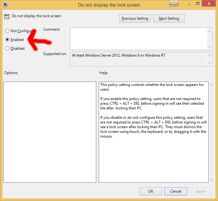
Disable the lock screen on desktop computers using the Local Group Policy Editor.  From the Start screen, start typing Group Policy and the option to Edit Group Policy will appear.  Choose that.  Then ‘Local Group Policy Editor>Local Computer Policy>Computer Configuration>Administrative Templates>Control Panel>Personalization>Do Not display the lock screen’ .  (Why MS makes its settings locations so obscure we’ll never know.  It is a weakness in comparison to OS X.)

SearchGroupPolicyEditor

LocalGroupPolicyEditor

EnableNoLockScreen

 If you prefer a lock screen to mask your Windows ID, you can set it to be a slideshow of one of your photo albums.  Click here for a tutorial on how to make that work.

Be aware that there are hot corners in the Windows 8.1 Start screen.  Clicking on the upper left corner reveals other open apps that you can click on.  This is the same as swiping in from the left on a touch screen.  Clicking on the lower right corner opens up Charms, including Search, Settings, Devices, etc.  This is the same as swiping in from the right.

When a Modern UI app is open, right click on it to see the app bar with the app’s functions and options.  This is the same as swiping up.  The upper right corner is a hot corner that will open the Share button.  This is the same as swiping in from the right.

There are some very cool keyboard shortcuts that help make Windows 8.1 RT easy and fun to use.  (Most of the old ones still work, too.)

toggles between the Start screen and the last open app
-S Search
-X (same as right-click on the Start button in the lower left corner) opens up a power user menu including the shutdown menu and powershell
-I opens the settings menu.

Many of us who have used Windows for years have found the adjustment to Windows 8 to be quite a jolt.  It reminds me of when I went from using DOS to Windows.  I personally like to open to the Start screen.  I like the live tiles that give me the weather, time, news headlines, sports headlines, and social media teasers.  The Modern UI apps from the app store that I have tried have been very compelling.  I especially like the Music and Sports apps.

Some people will want to make their Windows 8.1 computers behave more like a Windows 7 upgrade by hiding the juicy Modern UI of the Start Screen.  I don’t recommend that.  Accept the future.  Not for you?  Here is how you can almost roll back the clock to Windows 7.  From the Taskbar menu (right-click on the desktop’s taskbar), use Properties>Navigation to control when the Start screen will be displayed; whether your desktop and Start screen should share the same background; whether the Start button will open the Start screen or the All Apps app drawer.  If you are on an All Apps and Desktop only diet (avoiding the Start Screen boogie man), you can even organize the All Apps view by category and put the desktop apps first.  Of course, that will only work in Pro since RT doesn’t have desktop apps other than Office.

Look for these options and check the ones you want:

  • “When I sign in or close all apps on a screen, go to the desktop instead of Start.”
  • “Show my desktop background on Start.”
  • “Show the Apps view automatically when I go to Start.”
  • “List desktop apps first in the Apps view when it’s sorted by category”

Now, the only way the Start screen boogie man can get you is if you click on the  that appears in the lower left corner of the Apps view screen when you move your mouse.
For those seriously wistful for doing things the good old fashioned way, Start8 by Stardock can return to the Start button to its former glory (or faded glory depending on one’s perspective) and all for a meager five bucks.

One of my favorite Windows 7 features is available in either the App view or the Start screen.  Up until Windows Vista, one had to find a program or file in a menu or Explorer window.  Starting with Vista, all one had to do was hit the  key or click on the Start button and start typing.  This filled in the Search box and generated a list of apps, files, and folders with the characters in the Search box.  If your choice was on top, all you had to do was press Enter and it opened what you were looking for.

If one allows Windows 8 or 8.1 to open in the Start screen, all one has to do is start typing and the same thing happens!  If you enable the Bing Smart Search you’ll even get options from the internet.  (As a side note, to configure how Smart Search works, go to PC settings>Search and Apps>Search.)  Smart Search and the live tiles are why I still log into the Start screen.  But this function works just as well if one starts typing in the App view.

If you’re using a mouse on the Start screen, click the arrow  near the lower-left corner of the screen to open the app drawer.  (This is the same as swiping up.)  Right-click on any app or set of apps to add them to the Start screen (no need to hold down the CTRL key in Windows 8).  Right click on any set of tiles on the start screen and drag them where you want a new group to appear.  There is a little icon in the lower right corner you can use to zoom out and make groups of apps draggable.  Click anywhere to zoom back out when you’re done moving groups.  Right click on any tile to make group names editable.  Hitting the Esc key or clicking somewhere on the screen will return the screen to normal.

Right click on a tile to have the option to change its size.  You can also drag individual tiles almost anywhere you want.  Just keep in mind that columns of tiles come in pairs and that can’t be changed.

If you really miss the old Vista/Windows 7 links to Computer (now This PC), Network, Control Panel, Devices and Printers, and Default Programs you can pin shortcuts for any or all of these to your taskbar.

Unless you’re going to shutdown for more than 24 hours or so, you may want to try the iOS-style shutdown now available on some Windows 8.1 devices called InstantGo.  Close and save any open apps first.  Then just hold the power button until prompted to swipe down to power off.  If your device did not come with InstantGo you can add it as a shortcut.  The rest of us can use the -X keyboard shortcut to the shutdown menu, which works just fine for me.

To set up a Windows RT tablet, or if one wants to move forward to using the Start screen, one wants the best Windows apps which I’ve listed below.  One wants a home screen tailored to the way one uses one’s tablet and to one’s own sense of what looks nice.  I’ve illustrated which groups I put the various tiles into by my subheadings.

Windows Start Screen

Favorites group

  • Desktop (should be in top left corner)
  • Chrome  (Pro only not RT!!)
  • Google search app (leave Bing as default).  Note:  One cannot change IE to use Google for default search and IE is the only available browser for RT.
  • Calendar – requires importing your Google calendar into Outlook
  • Weather (native), The Weather Channel
  • Clock
  • Photos (native)
  • Videos (native)
  • People (native)
  • Food + Drink (native)
  • Mail (native) and/or Yahoo Mail or Thunderbird desktop (the latter being Pro only)

Listen group

Create group

  • Camera (native)
  • Sound Recorder (native)
  • Movie Edit Touch (Magix) ($5) or VideoStudio ($$$)desktop  if you have Surface Pro
  • Audacity for Windows RT or just Audacity desktop if you have Surface Pro

Book group

News group

Shop group

Watch group

  • YouTube+ ($2)
  • Netflix
  • Amazon Prime is in the works but not yet available except via the web
  • Video (native)
  • Movie Guide by Zuhlke Engineering
  • Windows Media Center is an add-on that is useful for people with Windows compatible TV tuners (Pro only)
  • XBMC  desktop (Pro only)

Work group

  • RT comes with MS Office
  • Surface Pro comes with an MS Office trial, replace that with LibreOffice unless you have the money to buy/subscribe to Office
  • Evernote Touch
  • Skitch Touch
  • Dropbox
  • GDrive Pro ($4)
  • Skydrive (native)

Other group

Search for other apps online here

Posted in Geeky | 1 Comment

Tablets and Personal Computing

Yesterday, we technophiles witnessed a very marked shift in computing. Apple announced their new 64-bit A7 processor and retina display, but in doing so, they pitched the iPad Air (9.7″ display) and iPad Mini (7.9″ display) as productivity tools. Whether you want to produce word processing, spreadsheets, or presentations, it can all be done in iOS . Produce music, movies, and photo books with it, also. Now, I've been doing that for some time, but now Apple is pitching these devices as mainstream productivity tools. I wouldn't want to part with the Logitech Ultrathin keyboard I'm using to type this, but together the keyboard and the iPad make a killer combo.

Also, occurring yesterday, Microsoft announced the new Surface Pro 2. This thing is like a MacBook Air with a touch screen instead of a keyboard. Both have the Intel Core i5 processor and 128 GB flash storage for $999. The 11″ Air has two USB 3.0 ports. The Surface Pro 2 has one USB 3.0 port but also has a microSDXC card reader.

We are closing in on being able to do anything on a tablet that we can do on a computer and just as quickly. Ultrabooks and MacBook Airs may still be the preferred mode of personal computing, but tablets are now approaching parity in power while continuing to become more portable and durable. I suspect that many will shift their personal computing from a laptop as their primary device to one of these new and awesome tablets. Computers in the old sense will be something we only use for work and even there will only have specialized applications. So, am I getting ahead of myself? Are we there yet?

Posted in Geeky | Comments Off on Tablets and Personal Computing

The Skin-ny on XBMC


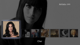
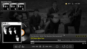
xbmc music artist slideshow

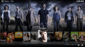
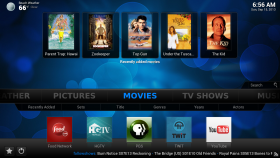
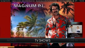
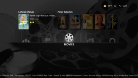
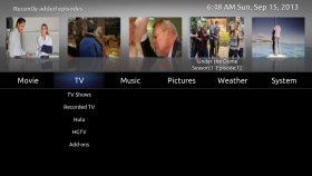
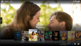
My wife and I enjoyed the Raleigh First Friday street fair and ate dinner at the Fiction Kitchen vegan restaurant. We even got some yardwork in and repaired the gas grill. But the real zen renourishment of my spirit came about Sunday afternoon. While Joy was downstairs refinishing furniture, I sat upstairs and worked through every XBMC skin I could. I love the way XBMC scrapes fanart for movies, TV shows, and music. So I went through each skin checking out how it displayed each of those categories when going through the library to pick out a show.

Movies

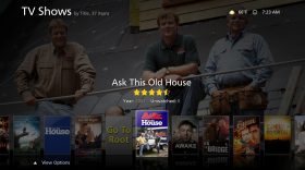
TV

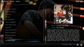
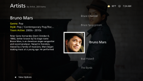
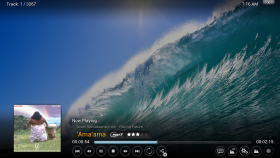
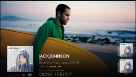
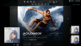
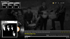
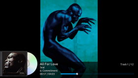
But XBMC is also a killer means of playing background music. I wanted a skin that would show artist and album art and song lyrics. Who doesn’t want to feed their ADD while relaxing to music?

Music

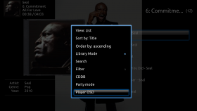
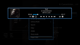
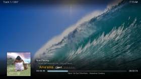
Music – Now Playing and Now Playing with Onscreen Display (OSD)

But one last virtue in a skin is the simplicity, consistency, and completeness of the menu navigation. Simplicity: Too many menus only reveal submenus when you guess whether to push the correct arrow key. These menus remind me of driving through Boston back in the 80’s. If you need a street sign to know where you are, you don’t belong on our streets. Consistency: Don’t you hate it when you leave Music or TV Shows or Movies in a beautiful library view but the next time you go to that menu item it opens up in File view? Completeness: A few are overly simple and don’t offer easy access to commonly desired submenus. I wish xTV-SAF included the Party Mode playlist in its Music submenus, for example. On too many menus, when you do get the submenus to appear the font is so small one has to get up from one’s chair and walk toward the screen to read them.

Home Screen

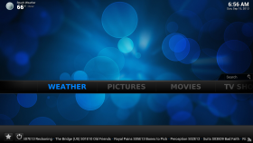
There are a number of skins that excel at displaying fanart and rock a good ‘Now Playing’ screen for music. I really like the feature rich Aeon MQ4, default Confluence, and beautiful Neon for this. One of the Lifehacker writers preferred Simplicity. One area where all of these skins lack is in the background pictures for the menus and ease of navigation. The default background pictures are typically those that would appeal to a juvenile science fiction fan. The good news is that one can customize the background pictures, customize what shows up in the menus, and put the menus into kiosk mode. Skins that don’t allow for this level of customization were eliminated from consideration.

In Neon, I love the fanart TV Show library view. It is hands down the prettiest interface for choosing a TV show, but many shows lack logo art and the gaps are quite jarring when scrolling through my shows – kind of like a beautiful smile but a front tooth is missing. If one is the least bit OCD, this will be very annoying. Aeon MQ4 has every feature XBMC allows but the navigation seemed even busier than Neon’s. Generally speaking, it seemed like the skins that did better at displaying fanart did worse at their menu design. The easiest navigation was using Quartz, a skin that mimics the Apple TV-style navigation. The TV Show and Movie fanart display was just average for this skin. Unfortunately, the Music ‘Now Playing’ screen was a static shot of the album art. It didn’t support the Last.fm artist picture plugin, the lyrics plugin, or the music extra fanart. If that support is ever added, I will probably stick with this skin because it is super easy to navigate and shows off the artwork of the TV Shows and Movies libraries reasonably well. But it is my understanding that the lead developer has moved on to focus on other skins.

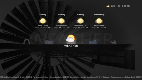
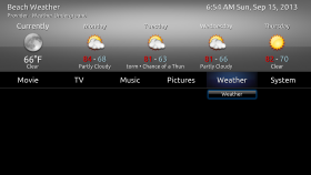
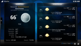
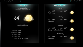
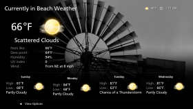
I like to surf waves even more than I like to surf channels.  Joy and I both enjoy going for walks.  So, we both enjoy having the weather on demand when we’re using XBMC.  The weather information is pretty sparse on XBMC  but makes up for lack of information with being very handy.  One can even get a snapshot of the weather in some skins just by rolling over the weather menu on the home screen.

Weather


It wasn’t for me, but for those who value pretty fonts, the nbox skin is also worth a look.

My primary skin is xTV-SAF. It has much of the streamlined navigation found in Quartz and allows for editing the home menu. The SAF in the name refers to “Spouse Acceptance Factor” suggesting the great navigation. The xTV in the name refers to the resemblance to the Apple TV (aTV). Unlike Quartz, one cannot add shortcuts above the home menu items, but one can add favorites as choices in the submenus below main menu items. The fanart views in both the Movies and TV Shows libraries is very good. The list in this view displays thumbnails instead of clearart logos and the odds are much greater that every show one watches will have a thumbnail than that it will have a clear art logo. Personally, every show I watch was represented. The music ‘Now Playing’ screen supported a fanart slideshow but I haven’t been able to get the lyrics addon to work just yet. Overall, xTV-SAF did the best job of any Frodo-compatible skin with the features I look for in a skin. It took a little tweaking with the skin settings (XBMC>Settings>Appearance>settings) to get the home screen the way I want it, but I think now that anyone could pick up a remote and do what they want to do with my XBMC setup. Navigation is that straightforward.

It was really fun going through each skin and trying it on for size. I’ve now disabled all but Aeon MQ4, Neon, Quartz, and xTV-SAF. After all, who says we have to be content with just one skin. This is XBMC, after all, not Apple.

Acknowledgements Comparison of Skin Features Skin Screenshots

Posted in Geeky | Tagged | Comments Off on The Skin-ny on XBMC

Low and Slow


New Nexus 7 in Play Store

Leo Laporte of the TWIT network has been touting the new Moto X as a phone to wait for. Hold off on that HTC One and Samsung Galaxy S4, the first Google-directed Android phone is coming out of the Motorola pipeline soon. I’ll be anxious to read full reviews of this phone. But frankly, after the excitement of the new Nexus 7 launch, the specs of the Moto X are a real let down after all the TWIT and general internet hype. 720p on a 4.7″ screen? Not that it is terrible, but at 316 ppi it trails just a tad behind the aging iPhone 5’s 326 ppi and is almost embarrassing in comparison to the S4’s 441 ppi. It isn’t low resolution, but also not exactly bleeding edge.

We’ll have to see how the new X8 architecture performs, but it is a dual core processor compared to the S4’s quad processor. At this point, phone performance is so great in general that I don’t think minor advantages in processing speed will be much of a selling point for Moto X’s competitors. I can’t wait to read reviews of the user experience here. Hopefully, the X8 architecture will result in a significantly better battery life. I haven’t seen any confirmation of that yet.

Another, head scratcher to go with the lower resolution and fewer cores, is the fact that the Moto X is apparently being released with the old Android 4.2.2 instead of the Android 4.3 available on the new Nexus 7. Oh, and the Moto X won’t even be a pure Android experience in its initial release.

Google finally had a chance to control the hardware, OS, and whether to skin a phone and we got the Moto X. For an Android flagship device, we’re left only with the Nexus 7. Like I said, I’ll wait for reviews to tell me about the Moto X experience. Maybe it will be greater than the sum of its specs – sort of like the iPhone and iPads. But right now the Google-Motorola engineering decisions are leading up to one great big yawn.

Posted in Geeky | Comments Off on Low and Slow